ShopDreamUp AI ArtDreamUp
Deviation Actions


Suggested Deviants


Suggested Collections


You Might Like…


Featured in Groups


Description
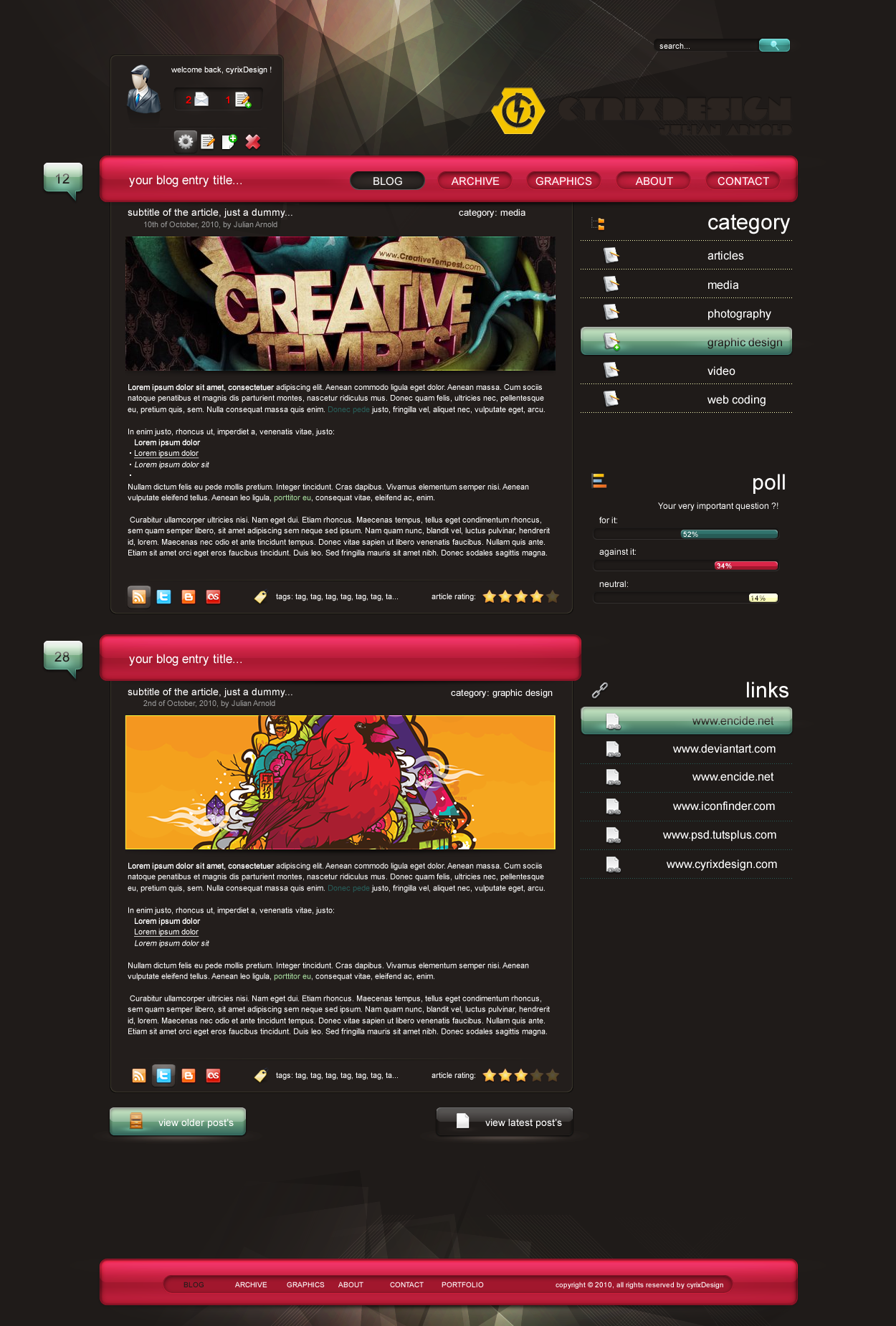
ok, this the 2/3 layout i been working on. hope you like it. some blog design maybe for myself. colors are from adobe kuler [link] (useful tool).
layout & background : Fireworks CS4
credits to [link]
and: [link]
icons: 50% myself, and [link]
-----------------
- for sale
includes one Fireworks.*png (CS4)
(images are only used as filling material)
(use icons only with permission of their author / designer)
price is negotiable !
-----------------
if you add it to your fav+, thx for your support !
comments are always welcome !
download for best quality !

")
layout & background : Fireworks CS4
credits to [link]
and: [link]
icons: 50% myself, and [link]
-----------------
- for sale
includes one Fireworks.*png (CS4)
(images are only used as filling material)
(use icons only with permission of their author / designer)
price is negotiable !
-----------------
if you add it to your fav+, thx for your support !
comments are always welcome !
download for best quality !
Image size
1250x1850px 859.77 KB
© 2010 - 2024 cyrixDesign
Comments64
Join the community to add your comment. Already a deviant? Log In
I need a professional web designer amount of money